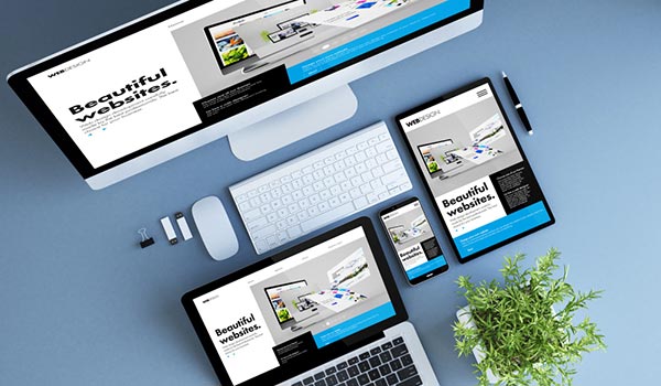
Responsive design is a graphic user interface (GUI) design approach used to create content that adjusts smoothly to various screen sizes. Designers size elements in relative units (%) and apply media queries, so their designs can automatically adapt to the browser space to ensure content consistency across devices.
Why Responsive Design is so Popular
In the early 2010s, designers had to address a historic phenomenon. More users were starting to access web material on handheld devices than on desktops. There were two main solutions. Designers could craft several versions of one design and make each have fixed dimensions (an approach called adaptive design). Alternatively, they could work on a single, flexible design that would stretch or shrink to fit the screen (responsive design). Organizations and designers found the benefits of responsive design hard to ignore. Rather than work with absolute units (e.g., pixels) on separate versions, designers were free to focus on just one design and let it flow like a liquid to fill all “containers”. Responsive design isn’t flawless. Nevertheless, it has significant advantages and its appeal has grown steadily. So has the number of free frameworks tailored to it. Responsive design has become one of several organizations’ (e.g., Google’s) mandatory features.
Responsive Design – The Technicalities
Responsive design has three core principles:
Fluid Grid System – Elements occupy the same percentage of space however large or small the screen becomes (i.e., users viewing designs on different devices). This means you choose where pixels should appear and define a layout size so the elements will scale up or down in a fixed way. It’s easier if you use a CSS (Cascading Style Sheets) grid system and generator for your design’s base (some are available for free). You need to calculate the target size divided by the context, as a percentage. This is your design feature’s maximum width divided by the maximum width of the users’ browser. When you apply these percentages of features to the required properties in CSS script, you’ll have a single design that expands or shrinks according to users’ screen size.
Fluid Image Use – Unlike text, images aren’t naturally fluid. That means they default to the same size and configuration from one device’s screen to the next. An obvious risk is that your design will appear inconsistent across devices as images can fail to adjust, and therefore show up out of proportion to other elements. So, you need to apply a CSS command—: img {max-width: 100%;}—to ensure an image shrinks for smaller screens. To include many images, you use another CSS command.
Media Queries – These are filters you use to detect the browsing device’s dimensions and make your design appear appropriately. With these, you probe to determine what size of screen a user is viewing your design on. These will alter the site layout to meet certain conditions. You also include these through CSS, and the most frequently used ones are min-width, max-width, min-height and max-height. So, based on a screen’s width, height, orientation, etc., you can accurately specify how your design will be rendered for different users to see.
You can choose from a variety of tools, such as Bootstrap, H5P, Gomo and Elucidat. Therefore, you don’t always need to have programming expertise.
Best Practice & Considerations for Responsive Design
With responsive design, you design for flexibility in every aspect – images, text and layouts. So, you should:
Take the “mobile first” approach:
Scale up phone-sized designs to suit larger screens.
Always remember that mobile users need large (>40 points) buttons. Also, your design must be twice as intuitive as desktop equivalents, since the need for well-sized elements on smaller screens can cause cramping and confusion.
Create fluid grids and images:
Create images in their native dimension. If you don’t have enough space, crop them to maximize impact.
Only use Scalable Vector Graphics (SVGs). These are an XML-based file format for 2D graphics, which supports interactivity and animations.
Include three or more breakpoints (i.e., design for 3+ devices).
Prioritize and hide content to suit users’ contexts. Check your visual hierarchy and use progressive disclosure and navigation drawers to give users needed items first. Keep nonessential items (nice-to-haves) secondary.
Aim for minimalism.
Apply design patterns – To maximize ease of use for users in their contexts and quicken their familiarity: e.g., the column drop pattern fits content to many screen types.
Aim for accessibility with font sizes/styles. Use contrast and background effectively. Make headlines at least 1.6 times bigger than body text. Make all text responsive so it appears in these proportions. As some users rely on screen readers, make all your text “real” instead of text within images.
Overall, responsive design is a powerful and economical approach, but its “easy” nature is deceptive. You can still run into difficulties if you use it without caution. See the table below.